

CampusDekho.ai
Helping students move from college discovery to confident decision-making.
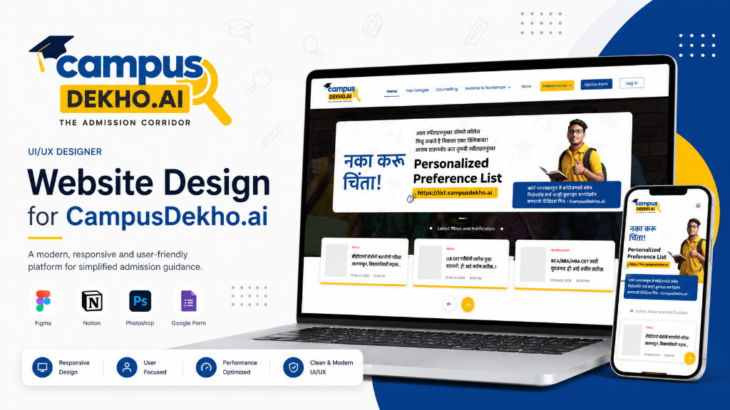
CampusDekho.ai is an EdTech platform designed to simplify the college-selection journey — connecting discovery, prediction, comparison, preference-list creation, educational content, and personalized guidance into one structured experience. I joined as the Product Designer responsible for the complete UX and UI lifecycle.
- 40,000+ colleges and universities
- Multiple entrance exams and complex counselling processes
- High stakes: Families investing years of savings
Information Overload
Students spent more time gathering data than evaluating it. Information was scattered across government portals, forums, YouTube, and college websites.
No Personalization
Generic college lists ignored what actually mattered — score range, budget, location, course preference, and placement record.
Preference List Chaos
Creating a ranked preference list for counselling was done on paper or spreadsheets, disconnected from any discovery tool.
Parent Disconnect
Parents — the financial decision-makers — had no access to the same research tools, creating information asymmetry within families.
I didn't start in Figma. I started with conversations. Before designing anything, I needed to understand how students actually research colleges — not how we assumed they did. The first few stakeholder conversations were revealing. Counsellors told me students often ask the same five questions in different ways. Parents wanted data they could verify. And students were overwhelmed not by lack of information, but by too much of it.
Stakeholder Interviews
Aligned on business goals, admission counsellor insights, and content strategy with product, marketing, and counselling teams.
Student & Parent Interviews
Qualitative interviews with representative students and parents across different admission journey stages.
Competitive Analysis
Evaluated Shiksha, CollegeDunia, Careers360 to identify feature gaps and UX patterns in the category.
Content & Search Analysis
Studied how students search for college information, what questions they ask, and what content formats they trust.
Key Research Findings
- Students don't read college profiles linearly — they compare. Every design decision needed to optimize for side-by-side evaluation.
- Parents and students have different priorities. Students care about placements and campus life; parents care about fees, ROI, and accreditation.
- The hardest moment isn't finding colleges — it's deciding the order of the preference list. That's where anxiety peaks.
Rahul P.
18, CET Aspirant"I've looked at so many college websites that they all blur together. I just want to know which ones I can actually get into."
Goals
- Compare colleges by placement
- Create a preference list
- Understand cut-off trends
Frustrations
- Contradicting YouTube advice
- Outdated college websites
- Friends sharing conflicting lists
Sunita D.
46, Parent & Decision-Maker"I'm investing our savings in my son's education. I need placement data and fee breakdowns — not flashy campus photos."
Goals
- Compare fees and ROI
- Verify accreditation
- Share shortlist with family
Frustrations
- Hidden fee structures
- No parent-friendly view
- Can't trust self-reported data
Student Empathy Map
- "Which college should I put first?"
- "Is this college worth the fees?"
- "When is the last date to apply?"
- "Am I making the biggest mistake of my life?"
- "What if I don't get any of my top choices?"
- "Everyone seems to know something I don't."
- Opens 10+ tabs comparing colleges
- Screenshots details for WhatsApp groups
- Changes preference list order multiple times
- Overwhelmed by contradicting information
- Pressure from family to choose wisely
- Fear of missing the right opportunity
The information architecture was organized around user intent — not internal categories. Instead of grouping features by type (Tools, Content, Services), the IA mirrors how students actually think about their journey: Discover, Decide, Learn, Get Help.
User Flow: College Discovery
User Flow: College Predictor
Wireframes prioritized structure over aesthetics. I needed to validate content hierarchy, CTA placement, and navigation patterns before investing in visual design. Key decisions at this stage: the homepage should function as a guided journey (not a landing page), the College Predictor should use a multi-step flow (not a single dense form), and the preference list should connect directly to discovery tools.
The visual system was designed for trust and clarity. Education is a high-stakes domain — the interface needed to feel reliable, not flashy. Blue communicates trust. Yellow draws attention to actions and important data. White space prevents cognitive overload.
The design system includes reusable components — college cards, blog cards, webinar cards, form steps, filters, navigation, modals, and CTAs — each designed with default, hover, active, disabled, error, and loading states. This ensures consistency across 20+ screens and reduces development time.
It's the entry point to the entire admission journey.
Each section serves a specific purpose — guiding students from initial awareness through feature discovery, content engagement, and finally to personalized guidance. The sequence mirrors the user's decision-making process.
8a. Hero & Quick Actions
The hero communicates the value proposition in under 5 seconds. Quick action cards below provide immediate access to College Predictor, Smart Selector, and Preference List — so returning users skip the scroll.
8b. Smart College Selector
Instead of another long directory, the Smart Selector asks students what they're looking for — score, location, course, budget — and narrows possibilities intelligently. This changes the interaction from "search through everything" to "tell us → get matched."
8c. Content Strategy (Webinars + Blogs + Broadcast)
Webinars
Live expert sessions building trust and authority
Blogs & Updates
Educational content organized by admission stage, not publish date
Broadcast
Video content for students who prefer watching over reading
Content isn't marketing material. It's journey support. A student using the Predictor who gets confusing results might read "Understanding CET Cut-Off Trends." A student creating a preference list might watch "How to Order Your Preference List."
8d. Personalized Guidance
Students exhaust self-service tools but still lack confidence.
Guidance pitched too early feels like a sales push.
Position expert consultation after all self-service content — where students are genuinely ready for human help.
8e. Mobile App Integration
The app CTA is positioned near the bottom — after users have experienced the web platform and understand its value. This prevents app promotion from competing with web engagement.
Feature Deep-Dive
College Predictor
The predictor was designed as a guided experience — one question per step. This reduces form abandonment and makes the tool accessible to students unfamiliar with admission terminology.
Preference List Builder
The Flow
Discover → Evaluate → Add → Remove → Reorder → Finalize
Why reordering matters: In Indian counselling, the order of your preference list determines your seat allotment. An incorrect order can mean attending a less-preferred college despite qualifying for a better one. This makes the reorder interaction the most critical moment on the entire platform.
College Card Architecture
Designed for the F-pattern scanning behaviour to help students compare rapidly.
Validating the Experience
A structured usability testing framework was designed to validate key user journeys.
Finding 01
Issue: Students couldn't quickly distinguish high-confidence predictions from aspirational ones.
Fix: Added visual match indicators to differentiate prediction strength.
Finding 02
Issue: The filter button on mobile wasn't prominent enough — users scrolled through unfiltered results.
Fix: Increased filter button prominence and added active filter count.
Finding 03
Issue: The initial Predictor form asked for too many fields.
Fix: Made location and branch optional, reducing required fields to exam, score, and category.
Business Outcomes
Reflection
Information Architecture Is the Product
In content-heavy platforms, IA is the highest-impact design decision. Getting the structure right made every subsequent design decision clearer.
Features Are More Valuable When Connected
A College Predictor in isolation is useful. A Predictor that feeds directly into a Preference List that connects to expert Guidance is transformative.
Trust Is a UX Requirement
In education, every unclear label, every outdated data point erodes trust. Students and parents are investing real money based on what this platform shows them.
Looking Back
The biggest lesson from CampusDekho was that good admission UX isn't about showing students more information. It's about helping them understand what to do with it. I didn't start by designing screens — I started by understanding the business problem, the student's decision-making journey, and the counsellor's most-asked questions. The visual design was the output of that thinking, not the starting point.
 ← View All Projects