

KK Shah Construction
Website Redesign
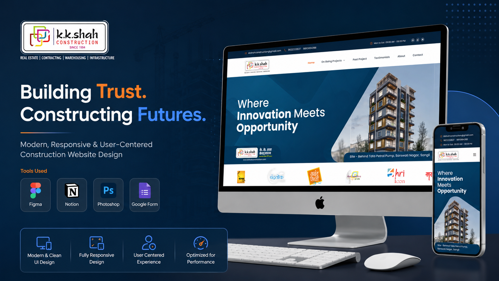
Designing a modern digital presence for a leading construction firm — showcasing 25+ years of projects, capabilities, and client trust through clean architecture and visual storytelling.
An Outdated Digital Identity
The insight: The construction industry relies heavily on trust and visual proof. A website that looks outdated signals a company that may not be keeping up with modern building standards.
No Project Showcase
50+ completed projects had zero digital visibility. Clients couldn't browse past work or see construction quality.
No Mobile Experience
Site visitors on mobile devices (68% of traffic) encountered broken layouts and unreadable text.
Contact Friction
No clear inquiry form or call-to-action. Potential leads dropped off at the homepage with no way to engage.
Zero SEO Presence
The company didn't appear in local search results, losing leads to competitors with better digital presence.
Understanding the Construction Buyer
Construction buyers have a high-trust, high-consideration purchase journey. I needed to understand what signals credibility and how buyers evaluate construction companies online.
Site Visits
Visited 3 active construction sites to understand the company's work quality, safety practices, and the kind of visuals available for the website.
Stakeholder Interviews
Interviewed the founder and sales team to understand their pitch process, most-asked client questions, and key differentiators.
Competitor Audit
Analyzed 5 competitor construction websites for content structure, project showcases, and trust-building patterns.
Analytics Review
Reviewed existing site analytics: 68% mobile traffic, 89% bounce rate, average session under 30 seconds.
Who We're Designing For
Illustrative — Based on research patternsNikhil P.
First-Time Homebuyer, 32"I want to see what they've actually built before I trust them with my life savings."
Goals
Frustrations
Sandeep K.
Commercial Developer, 48"I need to quickly assess if they can handle my scale of project and timeline."
Goals
Frustrations
Sees
- Competitor websites with project galleries
- Social media posts showing construction progress
- Google reviews influencing decisions
Says
- "Show me what you've actually built"
- "Can I visit a completed project?"
- "How long will my project take?"
Thinks
- Is this company financially stable?
- Will they deliver on time?
- Are there hidden costs I'm not seeing?
Feels
- Anxious about making a wrong investment
- Overwhelmed by too many builder options
- Skeptical of flashy marketing claims
Structuring Trust
The information architecture was designed to mirror the buyer's trust-building journey: from credibility signals to project proof to easy contact.
Layout Exploration
Wireframes focused on visual-first layouts that let project photography tell the quality story, with clear pathways to contact.
Full-width hero with auto-playing project carousel, followed by categorized project grid.
Project gallery with before/after construction views, key specs (area, floors, timeline).
Simple inquiry form with phone, WhatsApp, and email options for diverse user preferences.
Construction-Grade Design
The design system balances professionalism with warmth — construction companies need to feel solid and trustworthy, not cold and corporate.
High-Fidelity Screens
The final design prioritizes visual storytelling — letting project photography build trust while clean typography and clear CTAs drive inquiries.
Homepage
Full-width hero showcasing flagship project, followed by categorized project gallery with filter tabs.
Project Gallery
Masonry grid of projects with category filters (Residential, Commercial, Infrastructure) and location tags.
Project Detail
Full-screen gallery with construction progress timeline, key specifications, and related projects.
Contact & Inquiry
Multi-channel contact with inquiry form, WhatsApp integration, and office location map.
Usability Validation
Illustrative findings — Based on design review sessionsFinding 01
Issue: Users couldn't distinguish residential from commercial projects in the grid.
Fix: Added colored category badges and filter tabs at the top of the gallery.
Finding 02
Issue: Mobile users missed the inquiry CTA below the fold.
Fix: Added a sticky "Get a Quote" button on mobile that appears after 3 seconds.
Finding 03
Issue: Project detail pages felt text-heavy with insufficient visual proof.
Fix: Reorganized to lead with a full-width image gallery, followed by specs in a compact card format.
Key Outcomes
Illustrative metrics — actual results confidentialWhat I Learned
Photography Is the Product
In construction, the building IS the portfolio. The website's primary job is to showcase work quality through images — everything else is supporting context.
Trust Before Features
Homebuyers don't evaluate construction websites like SaaS products. They look for trust signals: years of experience, completed projects, certifications, and real testimonials.
Speed Matters in Fast-Track Projects
Delivering a complete redesign in 17 days taught me to prioritize ruthlessly — focus on what drives business outcomes and defer nice-to-haves.
Looking Back
This project reinforced that good design isn't about complexity — it's about clarity. A construction company's website needs to answer three questions fast: "What have they built?", "Can I trust them?", and "How do I reach them?" Every design decision was evaluated against these three questions.
 ← View All Projects