

Gov. College Rajgarh
Admission App
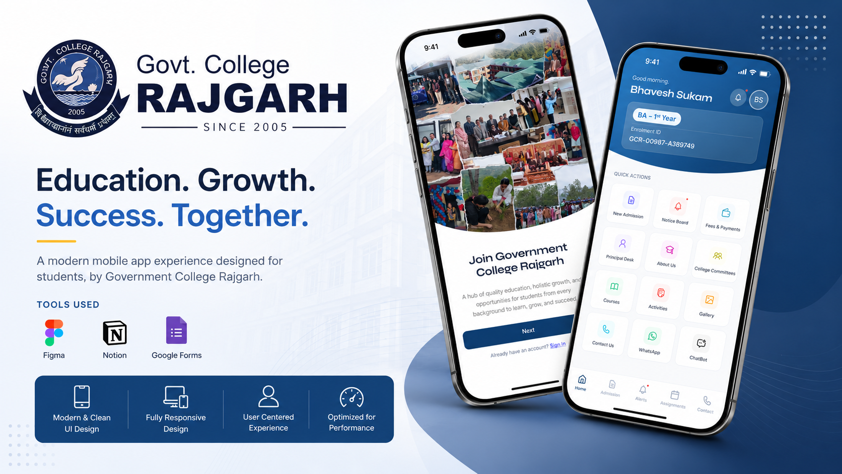
Simplifying the admission process for government college students with an accessible, mobile-first companion app.
Breaking Down Bureaucracy
Students struggled to navigate changing deadlines, document requirements, and shifting merit list updates. Because many students are from diverse socio-economic backgrounds and access the internet solely through low-end mobile devices, the app had to be incredibly accessible and performant.
Business Goals
- Digitize 100% of the initial application process
- Reduce administrative workload and manual data entry
- Minimize physical queues on campus during admission season
User Goals
- Create an accessible mobile interface for all students
- Provide clear, step-by-step guidance for form submission
- Deliver real-time updates on merit lists
Understanding the Reality on the Ground
Before designing the app, I conducted field research to understand the current admission bottlenecks and hardware constraints.
Admission Process Audit
Mapped the existing paper-based enrollment steps and required documents.
Student Interviews
Interviewed 12 students about their past experiences with college admissions.
Gov Portal Analysis
Evaluated existing state government portals for usability flaws and accessibility issues.
Mobile Testing
Tested preliminary concepts on budget smartphones with edge/3G connections.
Who We're Designing For
Illustrative PersonasSanjay K.
Rural Applicant · Limited Tech Literacy"I only have my older brother's phone to use at night. The internet drops constantly, and I get confused by too many forms."
Goals
Frustrations
Pooja M.
Urban Applicant · Managing Multiple Apps"I'm applying to four different colleges. I need to know immediately when a merit list is out so I don't miss my seat."
Goals
Frustrations
Empathy Map — First-Generation Student
Sees
- Crowded notice boards on campus
- Complex eligibility criteria tables
- Peers stressed about document validation
Says
- "Is my application submitted correctly?"
- "I don't understand this error message."
- "When will the second merit list be out?"
Thinks
- If I make a mistake, my year is ruined
- The process shouldn't be this difficult
- I hope my documents are approved
Feels
- Anxious about deadlines
- Overwhelmed by bureaucratic jargon
- Relieved when they see a green success mark
Seamless Admission Journey
The user flow was mapped to eliminate redundant steps, ensuring students move smoothly from onboarding to final enrollment.
Mobile-First and Inclusive
The core philosophy was to design for low-bandwidth environments and diverse digital literacy levels. I focused on clean navigation, prominent call-to-actions, and bite-sized information blocks to reduce cognitive load during a high-stress process.
 Lo-Fi: Streamlined Onboarding Flow
 Mid-Fi: Document Upload Interface
Trust and Legibility at Scale
Typography played a crucial role in ensuring the application was accessible on smaller, lower-resolution screens. The color palette was chosen to instill trust and provide clear status feedback. Official blue serves as the primary brand color, while distinct semantic colors alert users to their application standing.
The Mobile Companion
The final interface brings clarity to the admission chaos. Personalized dashboards, real-time notifications, and simplified forms ensure students always know their current status.
Student Dashboard
Centralized view of admission status and upcoming deadlines.
Validating with Real Users
Transforming the Experience
Complex, non-responsive web forms with tiny text.
Clear, step-by-step mobile flow.
Empowering Students
Illustrative metrics — based on project contextfor initial phase
completion time
in first month
Design for Extremes
Assuming a high-speed connection and a modern smartphone alienates a large portion of the student body. We had to optimize asset sizes and ensure offline capabilities to cater to all.
Simplification over Decoration
In utilitarian apps, aesthetic flourishes must take a backseat to clarity. Every visual element needed a functional purpose to avoid confusing users.
Empathy in Public Tech
Designing for public sector education requires deep empathy for the end user. It isn't just about creating modern interfaces—it's about removing barriers to entry and making institutional processes feel human and attainable for everyone, regardless of their technical proficiency.