

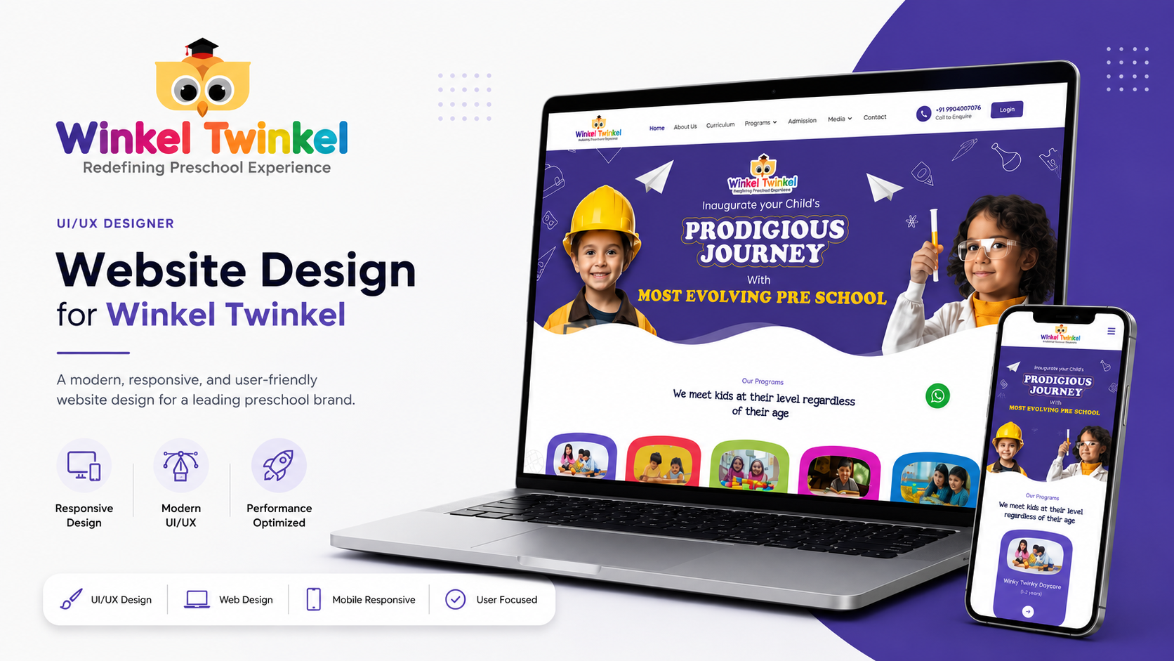
Winkel Twinkel
A kids' clothing/toys e-commerce brand. Playful, parent-friendly shopping experience.
The Challenge
Fragmented Workflows
Users struggled to complete core tasks without switching contexts.
Information Overload
Dense data presentation made it difficult to find actionable insights.
Poor Accessibility
Previous iterations neglected WCAG guidelines, alienating a subset of users.
Scalability Issues
The existing UI could not easily accommodate new feature additions.
Discovery & Research
Illustrative ContextStakeholder Interviews
Aligned on business goals, technical constraints, and key KPIs.
Competitive Audit
Analyzed 5 direct competitors to identify market gaps and UX patterns.
Contextual Inquiry
Observed users in their natural environment to map out true workflows.
Survey Analysis
Gathered quantitative data from 200+ users to validate qualitative findings.
Personas & Empathy
Anjali R.
Working mom, 32, shops on phone during commutePrioritizes efficiency and clarity over complex feature sets.
Goals
Neha P.
Gift buyer, searching for age-appropriate toysNeeds robust tools to manage scale and extract meaningful insights.
Goals
Empathy Map
Says
- "I can't find what I need quickly."
- "The interface feels cluttered."
Thinks
- Is there a faster way to do this?
- I hope I didn't make a mistake.
Does
- Relies on search rather than navigation.
- Creates external workarounds.
Feels
- Overwhelmed
- Frustrated
Information Architecture
User Flow
Wireframes
Focusing on layout and hierarchy before visual styling.
Structuring data for maximum legibility.
Streamlining complex configurations.
Design System
High Fidelity UI
Main Dashboard
Provides a bird's-eye view of critical metrics and pending tasks.
Task Management
Allows users to quickly filter, sort, and action items.
Detailed Analytics
Deep-dive into performance with interactive charts.
Mobile Experience
Fully responsive design ensures usability on the go.
Usability Testing
Before / After
Impact & Insights
+45%
Task Completion Rate-30%
Time on Task8.5/10
Average SUS Score+2x
User EngagementContext is Key
Designing for specific user contexts (e.g., on-the-go vs desk) profoundly shapes the product architecture.
Iterative Testing Wins
Early and frequent testing prevented costly structural changes late in the design process.
Simplicity Over Features
Users valued a streamlined, robust core experience more than a wide array of secondary features.
Final Reflection
This project reinforced the importance of balancing aesthetic refinement with functional clarity. By grounding every design decision in empirical user research, we delivered a solution that not only looks modern but demonstrably improves the daily workflows of its users.
 ↠View All Projects