Data Without Direction
Leadership had access to raw operational data but lacked a unified dashboard. Department heads were exporting CSVs and building manual spreadsheet reports — consuming 6+ hours weekly per manager.
Strategic Goals
- Real-time operational visibility for leadership
- Automated KPI tracking across departments
- Role-based access for sensitive data
- Mobile-accessible executive summary
Key User Needs
- At-a-glance production status
- Exception-based alerting (anomalies only)
- Historical trend comparison
- Employee scheduling and shift management
02 — Discovery
Understanding Decision-Makers
I shadowed 3 department heads for a week, documenting their information-seeking patterns. The biggest finding: managers check the same 5 metrics every morning. This became the foundation of the dashboard layout.

03 — Wireframing
Low-Fidelity Wireframes
Wireframes prioritized information hierarchy — placing the 5 most-checked metrics at the top, with progressive disclosure for deeper data exploration.
04 — Design System
Data-Optimized Typography
Data-optimized type system for analytical dashboards. Monospace numerals for table/chart alignment, proportional sans-serif for reports and summaries during extended monitoring sessions.
05 — Final Designs
High-Fidelity Screens
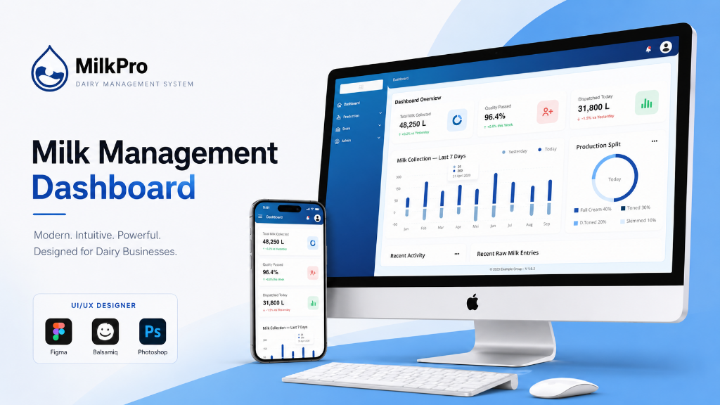
The management dashboard transforms raw data into clear, actionable views. Real-time analytics, exception-based alerts, and one-click drill-downs empower leadership to make faster decisions.
06 — Impact
Key Outcomes
07 — Reflection
Strategic Thinking
The management dashboard is the strategic layer — where operational data becomes business intelligence. Every visualization decision was guided by: "What action does this enable?"