

Shopease Website Design
Designing a frictionless, modern e-commerce platform that enhances product discovery and streamlines the checkout process for higher conversion rates.
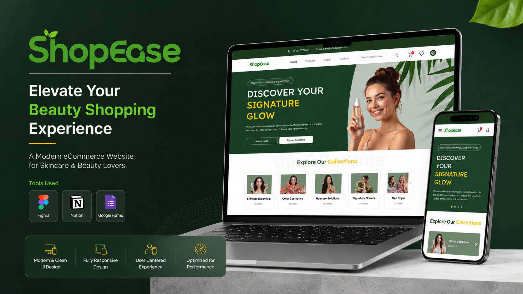
Overcoming E-Commerce Friction
The insight: Shoppers didn't just want to buy products; they needed a clear, guided path to checkout without unnecessary steps. Every additional click or confusing UI element became a point of friction that led to drop-offs.
Business Goals
- Reduce cart abandonment rate by 15%
- Increase average order value
- Enhance product discoverability
User Goals
- Intuitive navigation and search
- Clear, transparent pricing and shipping
- Seamless, single-page checkout
Understanding E-Commerce Friction
To improve the shopping experience, I focused on visual clarity and reducing cognitive load throughout the user journey by analyzing the drop-off points.
Checkout Funnel Analysis
Analyzed the drop-off rate from add-to-cart to successful purchase.
Cart Abandonment Research
Surveyed users to understand why they leave items in the cart.
Competitor UX Audit
Reviewed leading platforms to identify established e-commerce design patterns.
Heatmap Review
Evaluated click and scroll behavior on the previous product detail pages.
Who We're Designing For
Illustrative PersonasMeera S.
Busy Professional · 32 years old"I shop online because I don't have time. I want to find what I need, pay, and get on with my day."
Goals
Frustrations
Arjun K.
University Student · 21 years old"I always compare prices across different sites to make sure I'm getting the best possible deal before buying."
Goals
Frustrations
Optimizing the Checkout Funnel
We simplified the user journey, ensuring every step naturally guides the customer toward a successful purchase without friction.
Frictionless Path to Purchase
Wireframes prioritized visual clarity, guiding the user towards the primary CTA at every stage.
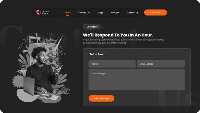 Low-Fidelity Structure
 Checkout Flow Planning
E-Commerce Visual Identity
Clean, readable typography paired with an inviting color scheme to build trust and allow the products to stand out. The color palette focuses on guiding user actions.
A Seamless Shopping Experience
The redesigned platform prioritizes high-quality imagery, straightforward navigation, and an optimized checkout flow.
Product Discovery
Enhanced search and filtering to help users find what they need instantly.
Frictionless Checkout
A streamlined, distraction-free checkout to minimize cart abandonment.
Refining the Checkout Flow
Removing Friction
Too many steps and hidden costs.
Transparent pricing and swift payment.
The Results
Illustrative metrics — based on project contextcart abandonment
checkout time
average order value
Design Meets Business
This project reinforced that effective e-commerce design requires balancing aesthetic appeal with strict conversion goals. The ultimate measure of success isn't just a beautiful layout, but a seamless transaction that leaves the customer satisfied and willing to return.